
The 5% Solution: A very interesting technical indicator
Art For Art's Sake, Money For God's Sake...No, this is not an homage to the financial archangel Lloyd Blankfein and his flock of chaste and devoted followers on Goldman's prop desk. Okay, lets get to the heart of what we want to look at this month. Be prepared, this is one of those discussions where we are going to let pictures do a lot of the talking. At Contrary Investor, we deal with a lot of fact and fundamentals, but we'll be the first to acknowledge that technical analysis likewise takes a front row seat in the decision making and risk management process. In our book, the marriage of fundamental and technical analysis is a must. Ignore either and you might as well be flying blind. The discussion this month centers on the technical. Early this year on our subscriber site we looked at the analog of equity movement in the 2003-2004 period relative to 2009-present, pointing out differences in the fundamental backdrop of then versus now, but also the similarities in terms of equity market technical directional rhythm, equity sector performance, etc. We also suggested that just about the last thing the consensus outlook was predicting for early year 2010 was a sideways correction. It just so happens that in 2004 after rising about 4% in the first part of the year, equities went into a sideways correction that really did not best the early January price highs until about the final six weeks of the year. As always, no two periods are ever completely identical, but after a few months of equity market action this year, we believe it's appropriate to review this analog now, but dig a whole lot deeper and cover a much greater amount of historical experiential territory for clues as to what might lie ahead. Yes, this is about the short term and the overriding principal of risk management. The analog of 2003-2004 relative to the present is captured in the top clip of the chart below.
At least for now, the initial price dip this year is much deeper than was the case at the outset of 2004. Where we move ahead is really anyone's guess, we just thought it useful to look at the character of the sideways consolidation pattern over the first three quarters of 2004. As documented, the worst of the sideways correction in that year was the third dip registering (7.1%) on the equity market Richter scale. From the greater period measured from the price peak in the early Feb-March period of 2004 to the bottom in August, we are talking about a high to low decline of roughly (8%). Very tolerable in a sideways correction. In fact, forget tolerable, it was healthy. Exactly the base the equity market needed to build so as to work its way higher as the economy and corporate earnings continued to improve as 2004 unfolded. In the current year, the closing high to low correction for the S&P has been 9.2%, not that far off the maximum 2004 draw down, at least so far. So before getting too worked up about the recent dip, we need to see just how the character of the equity market develops from here. If the hurt continues unabated in deeper magnitude and perhaps moves toward a double digit price erasure, then we'll have an issue.
The 5% Solution?…It just so happens there is another technical demarcation line we mentioned when we had a look back at the 2004 experience and beyond on our subscriber site a few months back that we believe deserves mentioning right now as we contemplate a trading range environment. It was the fact that from 2004 to the equity peak in 2007, the S&P NEVER traded at a level over 5% below its 50 day moving average. Not once, as is clearly documented below. This is the exact chart we showed on our subscriber site a few months ago, now updated through February. Talk about consistency, of course in the absolute clarity of hindsight it was indeed a first rate trading tool as it just doesn't get much better than this.

David Fuller's view I have mentioned on several occasions that the ranging correction we have witnessed over the last few months reminded me of 2004, in that it was the first significant pause in the cyclical bull trend for global stock markets. That was not a serious correction, as you can see from this weekly 10-year chart of the S&P 500 Index. However it was lengthy, causing some concern at the time.
Recently, our main analytical debate, which we have mentioned several times in Comment and the Audios, was: 1) whether major stock markets could rebound from their rising 200-day MAs and resumed their cyclical bull trend (40% possibility) or, 2) experienced a considerably longer and probably deeper correction (also rated a 40% possibility). We will not know, definitively, until after the event but the 1st possibility looks more likely following the persistent rally from last month's lows. Moreover, investors with significant long positions in equities can relax provided their stock market positions remain above February's reaction lows.
Now I would like you to consider Contrary Investor.com's 50-day MA indicator.
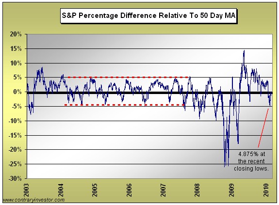
This looks very useful in differentiating between a relatively minor correction, which is a buying opportunity, and something more serious. Why would minor corrections for the S&P 500 end 5% or less beneath their 50-day MAs? For the same behavioural reason, I conclude, that the 200-day MA is a useful trend-smoothing device. If a sufficient number of influential people in the market monitor them, they will initially be buyers near the 200-day MA and / or near a 5% dip below the 50-day MA. In other words, if a number of people anticipate support near a specific level, they will help to make it self-fulfilling. We have added this indicator to the list of enhancements currently under development for the Chart Library.